Tuesday, November 12, 2013

Nontraditional Portraits


So for this project I chose to do a portrait of my dog and I decided to make it out of Cheetos. I spray painted the different cheetos to show the differences of shading. I chose to do my dog because I feel that he is a very interesting subject to do. While brain storming  for the project I decided to use cheetos because our family has an ongoing thing that he smells like cheetos, so I thought that it would be funny if I were to make him out of cheetos. It had impacted my piece by making it seem as if it my dog were made out of cheetos. The risks I took in this project were that I had to strategically place the cheetos so that they could fit as close together as possible. The challenges I faced were that some cheetos are larger than others so I had to constantly flip them or break them to the flatter side of the cheeto would stay down with the glue. I don't really think my choices impacted the piece that much. I tried not to break the cheetos too much because I wanted to make it look like it came together naturally. I overall enjoyed this project!

-jayce

Thursday, October 17, 2013

Sticky Situation


I really liked my idea for Sticky Situation because I really stretched the boundaries for what was expected. I had developed my ideas for this because I thought that being suspended in the air held up by thousands of helium filled balloons would pretty much put you in a sticky situation. I guess you could say I thought outside the box because I know that a lot of people just chose literal sticky stuff like gum or glue or tape, something like that. I showed repetition in this painting by adding all the balloons. I chose acrylic paint because I believe it is easier to work with and I think that it shows bolder colors than watercolor. Without acrylic I wouldn't of been able to make the white snow on the mountains and make them the way they are. The mini lessons that we did were crucial because it taught me how to add value and shading to the painting. This project is a thumbs up from me!

-Jayce Abel

Friday, September 27, 2013

Up Close and Personal


I had developed this idea for up close and personal because I liked how it was closing in on fall and Halloween so I had decided to take advantage and use a pumpkin. I had another design of doing a skeeball theme which is an arcade game. But because the skeeball idea was a little too complex and involved straight lines which I really didn't really want to do.I think that in this project I had really shown some technique to make this project great. The medium would have to be the pumpkin because it is the main attention on the whole page.I demonstrated emphasis in the project by adding lighter colors to show that it was underneath the sun and that it was three dimensional and one or two dimensional. I had actually really liked this project far more than our last project. 

-Jayce Abel

Monday, September 23, 2013

What's the Point


This project I believe was an ok project because I am more of a three dimensional building kind of guy and not really a drawing kind of person. But I liked I chose Clocks as my idea because it's a really good thing to explore. You can really do anything with clocks which is why I chose to do them. I showed contrast in this project by drawing different sized clocks and making the background a clock.I had also made the middle the light source so all the clocks seemed to be moving towards it also. Some techniques I used in this project was the use of sort of layering, I don't really know the exact name of it but having a background and a foreground. I don't really think I had taken any risks in this project because it was the first one of the year so I had done it cautiously, I will be taking more risks later on. I overall had mixed emotions about this project.
-Jayce Abel

Monday, May 6, 2013

Print making project

The process to make this project was easy. Making the print multi colored was not that bad because sometimes the colors would become one so i had to even it all out. My kangaroo design wasn't my favorite but I think that the colors made it better. Apparentley my cuts weren't deep enough so it didn't flow. Trying to make the print straight was hard because sometimes I didn't put it down right. But i did like the project because I liked picking out the amimal. My craftmanship wasn't that good but I liked it.

Tuesday, April 16, 2013

Photoshop biz


In our photoshop unit, we made two images, one was a frog tongue and the other was a monster pancake. I personally didn't like it because there are so many steps that when not executed can mess up your whole entire project. I do like the idea of being able to create a whole new thing with just blending and shading and mixing and matching things. My favorite of the two is the monster pancake because I liked how we could open up the pancakes and insert the mouth. The tongue and frog one was sort of hard because their was a lot of  blending the tongue color on to the frog which I thought was very time cosuming. If I had to I would recommend this project because I am sure that other people would enjoy this project. I would like to just make it my own, and actually chose what I am photoshopping.

Friday, March 22, 2013

Stencils


I had really liked this project because it was hands on and it was larger than life. I liked how my stencils sort of overlapped so the spray paints made a different color. I thought I had done a good job because it looks a lot like me. I chose these colors because they were reggae colors and all those colors go good together. I wish I could of had a better expression but it ended up being okay in the end. The hardest part of this is cutting out the stencils because it hurt my hands and the funnest part was spray painting. This was my favorite project by far this year.

Tuesday, February 26, 2013

Contour shoe drawing


This contour shoe drawing was rather hard because I had to draw this show at an angle and the shoe was worn down so I had to draw it with a rounded sort of shape. Also their was a lot of detail in the shoe so I had to take a lot of time in adding all this while keeping my pencil down. Overall my hardest feature was making the shoe's tongue look like it was sunken inside of it. I liked this project because I personally really like drawing shoes. Overall I liked this a lot.

Wednesday, February 13, 2013

Oil Pastels and Ipad

   Their is a huge difference I think between drawing these figures with oil pastels, and on the ipad. One of the big differences is that while on the ipad, you are able to blend the colors together, unlike with the pastels. Another difference is with the oil pastels, it is easier to navigate around the page easier than it is electonically. Some things that I have learnded through out this unit is how much blending can affect a painting. The dark and the lights in the picture really gives it an essence of the light source all around the painting. Instead of putting in a smiley face sun, you could just add some darks and lights and people can sense the sun is there. Overall I have enjoyed and learned a lot from this unit, but I must say that it is rather messy with the pastels.

Friday, February 1, 2013

Skeleton Cartoon

/
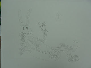
This Drawing of Bugs Bunny, I think is ok. It's not my best work but I think that the bone structure of the ribs and legs came out alright. The skull of Bugs Bunny was rather hard because I couldn't quite get down his huge jaw bone. These bones picture a real live bone set by representing, the hands, the ribs, the feet, the legs etc. Thsi drawing didn't require that much creativity because Bugs Bunny has a rather human-like figure. The only thing that I had to make up was the ears because I didn't know if there was a bone that connected it or not. But overall, I think that this was a very fun project to do.

Jayce Abel